Tag: creating

  • Creating websites using ChatGPT can be achieved with basic techniques.

    Creating websites using ChatGPT can be achieved with basic techniques.

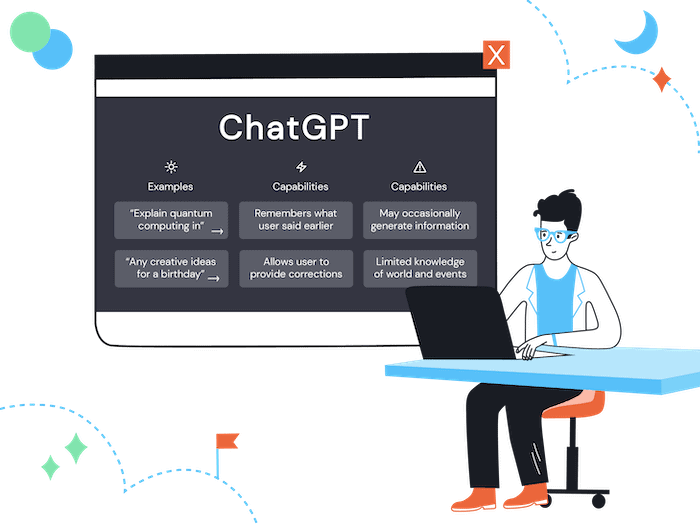
    Artificial Intelligence has made developers’ tasks easier by offering effortless text creation and layout options. Have you thought about using ChatGPT to build a website?

    This AI created by OpenAI offers assistance throughout the entire process of constructing a website using the right commands.

    This article will delve into the step-by-step process of making a website with ChatGPT.

    Continue reading to discover more!

    What you should understand before making websites with ChatGPT?

    Before utilizing the AI tool, it is important to follow certain guidelines when formulating queries for ChatGPT.

    • Provide details.
    • Give background information.
    • Utilize simulations (role-playing).
    • Use quotation marks.
    • Provide illustrations.

    Therefore, you can make sure that you are utilizing the bot to its maximum potential.

    Now that we have a basic grasp of how a ChatGPT prompt functions, let’s examine some illustrations.

    Creating websites using ChatGPT.

    ChatGPT can greatly streamline website development, particularly within the WordPress framework.

    Here are several methods in which ChatGPT can simplify the website creation process.

    Create material

    Ask ChatGPT to generate text or descriptions for the pages of your WordPress site by giving a short direction, like “Produce an appealing description for the ‘About Us’ page.”

    Designing arrangements and visual components

    Ask ChatGPT to create HTML or CSS codes tailored to customize the design of a page on your WordPress website.

    Ask ChatGPT to generate a CSS code for customizing the header style of your WordPress site. The response will be a CSS prompt.

    SEO optimization means optimizing for search engines.

    Use ChatGPT to create meta descriptions and titles that are optimized for SEO, enhancing the visibility of your WordPress website on search engines. Ask questions such as:

    • I require an optimized meta description for the homepage of my WordPress website.
    • Can I get suggestions for catchy blog post titles in WordPress that improve SEO?
    • Can you offer compelling strategies to boost the click-through rate on my WordPress site’s search results?

    Solution for Technical Issues:

    If you encounter a particular technical problem on your WordPress website, refer to ChatGPT for instructions on how to fix or enhance the code. For instance:

    “I’m encountering a technical issue with showing pictures on my WordPress website. Any advice on how to fix this?”

    Developing particular scripts and functions.

    Ask ChatGPT to create code snippets or scripts for implementing specific features on your WordPress site.

    For instance:

    “May I receive a script for setting up a dynamic image gallery on my WordPress website?”

    Afterward, you simply have to personalize the image list by inserting the URLs of your own images.

    How can I incorporate ChatGPT into my website?

    Integrating ChatGPT into your website is an uncomplicated procedure that includes setting up an account on the ChatGPT API and embedding the code on your website.

    Create an account on the ChatGPT website to access the ChatGPT API, and generate a ChatGPT code by purchasing an OpenAI subscription.

    Shortly after, proceed to implement the codes on your website.

    The ChatGPT code will be displayed as a chatbot widget, enabling customers to utilize the chatbot services.

    Will Google punish your website for utilizing ChatGPT?

    There is no need to be concerned about Google penalties when using ChatGPT on your website, even though it is a frequently asked question.

    Google ranks your website depending on its content and user experience. If ChatGPT enhances user experience, it will boost your SEO.

    Using ChatGPT’s content on your website without appropriate editing may lead to penalties from Google.

    Google states that it opposes AI-generated content that is of poor quality and lacks user intent.

    Ideal for developing websites with ChatGPT functionality.

    Now that you know how to utilize ChatGPT for website development, we have chosen some helpful prompts.

    Simply paste the question directly into ChatGPT.

    1. Create a navigation menu that adjusts to different screen sizes.

    Provide HTML and CSS code for a mobile-friendly navigation menu.

    Embed the HTML and CSS code generated into the appropriate sections of your website. Test the functionality on various screen sizes to confirm responsiveness.

    Add interactive comments to a webpage.

    Create a JavaScript script that enables users to add interactive comments on a webpage.

    Integrate the JavaScript code generated onto the designated page to display and engage with comments.

    Customize the 404 error page.

    Create a personalized HTML page for a 404 error with a user-friendly layout and recommendations for navigation.

    Use the HTML code provided to set up a personalized error page with helpful links and a welcoming message for lost visitors.

    4. Generate forms.

    Create an HTML code for a basic contact form.

    Firstly, paste the generated code into an HTML file on your website and adjust the fields as required.

    Generate CTA Buttons (Call to Action).

    Obtain a CSS design for a visually appealing ‘Buy Now’ button.

    Apply the CSS code created to your HTML button, customizing colors and styles to match your website’s visual branding.

    Highlight an image by hovering the cursor over it.

    Create a CSS effect that enhances an image when the cursor moves over it.

    First, copy the CSS prompt and add the generated class or ID to the image element in your HTML. Then, ensure to incorporate the hover effect logic in your CSS file.

    Create a pop-up message.

    Create a JavaScript script that shows a newsletter pop-up after 10 seconds of visiting the website.

    Integrate JavaScript code into your website to customize the pop-up content and display time, ensuring it is not disruptive to the user experience.

    Begin making websites using ChatGPT immediately!

    In summary, ChatGPT is a useful tool for website creation, streamlining processes, and producing codes effectively.

    ChatGPT is a valuable resource for web developers and enthusiasts, offering the capability to bring ideas to life.

    A dependable hosting service is crucial when launching your website.

    Choose Hostbits for efficient and dependable WordPress hosting services.

    Embark on your digital adventure with the ideal blend of content creation and web hosting!

  • Creating and viewing results on Google Forms explained.

    Creating and viewing results on Google Forms explained.

    Have you ever found yourself unsure about how to gather data from customers, conduct internal surveys, or manage event registrations?

    Google Forms utilize forms to accomplish tasks.

    They are easy to make and highly beneficial, they can help a company with its daily operations in multiple ways.

    One of the most commonly used tools for this purpose is Google Forms.

    You can easily generate personalized surveys, polls, and forms with this tool.

    It enables you to observe and assess outcomes in a structured and comprehensible manner, which aids in expediting decision-making.

    It’s time to discover how this tool can streamline your daily tasks if you haven’t yet explored it.

    Let’s demonstrate how to make forms and monitor outcomes effectively.

    What is Google Forms and how does it function?

    Google Forms is a useful and complimentary tool included in Google Workspace.

    You can use it to make specialized forms for easily and rapidly gathering information.

    Google Forms enables you to create a variety of question formats, including multiple choice, check boxes, and scales, for purposes like conducting satisfaction surveys, organizing events, or collecting customer feedback.

    All tasks are completed on the internet, and replies are saved in the cloud for convenient real-time access and monitoring.

    You can connect the forms with Google Sheets to create automatic reports or access visuals and data directly from the tool.

    You don’t need to be a tech expert to use it – simply create, share the link, and monitor the outcomes!

    Why is it beneficial to make forms using Google Forms?

    Creating forms on Google Forms provides many benefits for businesses and individuals looking to streamline the process of collecting and organizing information.

    Google Forms is an uncomplicated tool.

    Google Forms is popular due to its straightforwardness and effectiveness.

    This means you do not require extensive programming expertise.

    Anyone has the ability to generate a form, share it with customers, employees, or partners, and gather immediate responses.

    Forms have many different uses.

    Creating forms in Google Forms also offers the benefit of being versatile.

    You have the ability to personalize queries, choose different types of responses (like text, multiple choice, or drop-down menus), and include images and videos.

    Google Forms is perfect for various uses due to its versatility.

    • Market analysis.
    • Event registration.
    • Feedback and internal procedures
    • Performance evaluations or;
    • Inventory management.

    Google forms are compatible with other software systems.

    Google Forms integrates smoothly with Google Sheets, making data analysis and reporting easier.

    By utilizing Google Forms, you are already making progress in streamlining and automating your company’s operations.

    Any company can access it.

    Google Forms is a cost-effective tool suitable for companies of all sizes as it does not require specialized software or extra expenses.

    Usability, along with these advantages, makes Google Forms an intelligent option for businesses seeking efficient solutions to enhance communication with their customers and teams.

    Creating a form on Google Forms involves a series of sequential steps.

    Here is a simple guide to assist you in making a form using Google Forms.

    1. Access Google Forms by visiting the website (https://forms.google.com) and signing in with your Google account.
    2. Begin a new form by selecting “White” to start fresh or opt for one of the available templates if you have a particular idea in mind.
    3. Enter the title and details of your form at the top of the page, outlining the purpose for participants.
    4. Click on the “+” symbol to add a new question by selecting the answer type (text, multiple choice, checkbox, etc.) and inputting the question.
    5. Customize the form by altering the theme, adding sections, or incorporating images and videos as needed.
    6. Adjust the configurations: Access the gear icon located in the top right corner to set preferences like receiving email alerts or restricting sending to one message per individual.
    7. Click “Send” when you are prepared to submit the form. You may distribute the link through email, social media, or embed it on your website.

    Are my forms easily accessible in Google Forms?

    It is simple to retrieve your forms in Google Forms.

    After creating the form, you can always access it by logging into your Google account and navigating to Google Forms to view the list of forms you’ve made.

    You can indeed see initial results in real time.

    Google Forms enables you to track responses in real-time using charts and tables located in the “Responses” tab of the form.

    Create forms using Hostbits!

    Count on Hostbits for access to all the features of Google Forms and the Google Workspace productivity suite.

    We are official Google Workspace partners and provide full assistance to ensure you maximize benefits and productivity.

    Hire our services to simplify the handling of your forms and other tasks!

  • Creating a mobile site that is quick and interactive (Step by Step)

    Creating a mobile site that is quick and interactive (Step by Step)

    The internet is readily available on your mobile device. With 60% of Brazilians using smartphones to access the web, having a mobile-friendly website is no longer an advantage, but a necessity.

    Being present on the internet alone is insufficient.

    If your website is slow to load or doesn’t display properly on mobile devices, you risk losing visitors quickly.

    No one tolerates slow or unresponsive pages.

    Creating a quick, responsive, and user-friendly website doesn’t have to be difficult.

    In this article, we will guide you through the process of optimizing your digital presence for mobile devices.

    Shall we begin?

    What is a website designed for mobile devices?

    A mobile site is a tailored version of your primary website, specifically created to function effectively on mobile devices such as smartphones and tablets.

    It adjusts to smaller screens on its own, ensuring that everything is well-organized, easy to read, and quick to navigate.

    Have you ever attempted to view a mobile website and found yourself needing to zoom in to read the text or scroll horizontally because the layout was not responsive?

    This website is not mobile-friendly.

    Entering a fast-loading e-commerce site with large, easy-to-click buttons and smooth navigation is a prime illustration of a mobile site done right.

    A mobile site is more than just a scaled-down desktop version; it is a carefully designed experience for mobile users.

    Responsive websites and mobile websites: Is there a distinction between them?

    Many individuals mistakenly consider mobile sites and responsive sites to be interchangeable, but they are not identical.

    Website

    A distinct edition of the primary website is developed solely for mobile gadgets, featuring a unique design and potentially reduced content for quicker loading. An illustrative instance is websites utilizing a designated subdomain like “m.yourwebsite.com.”

    Website that is able to adjust and adapt to different screen sizes.

    The website is designed to automatically adjust to different screen sizes, such as computers, tablets, or smartphones. The layout changes, buttons are resized, and elements are rearranged to enhance user experience without requiring a different version.

    Today, a responsive website is the most advisable choice because it is simpler to manage, enhances SEO, and provides a consistent user experience on various devices.

    Best strategies for optimizing your mobile website

    By following these guidelines, your mobile website can provide an improved user experience and increase the likelihood of turning visitors into customers.

    Focus on creating a website that is responsive instead of designing a separate version.

    Maintaining two versions of a website can lead to discrepancies and make updates more difficult. A responsive site adjusts to different screens, providing a consistent experience for all users.

    2. Turn off annoying pop-up windows.

    Visitors dislike being greeted by numerous full-screen pop-up windows when accessing a website. These pop-ups not only annoy users but can also negatively impact Google rankings.

    Organize information using user-friendly menus.

    On mobile devices, it is important to use straightforward and user-friendly menus, like the popular “hamburger” menu, to avoid confusion due to smaller screens.

    4. Ensure buttons are big and easy to click.

    It can be frustrating when you accidentally open something else because you tried to click on a small button. Buttons should be a proper size and spaced out well to prevent misclicks.

    Bet on sources that are easy to understand.

    If the reader has to zoom in to see the text clearly, it indicates an issue. Opt for larger fonts and appropriate sizes and contrasts to ensure easy readability.

    Optimize pictures to ensure quick loading.

    Large images can slow down the website, so optimize them by reducing their size without compromising quality and use modern formats such as WebP for faster loading times.

    Avoid having too many items on the page.

    Having too much information and unnecessary elements can lead to longer loading times. Therefore, focus on a clean and straightforward design to improve loading speed.

    Make sure that the forms are simple to complete.

    Reduce unnecessary fields and utilize autofill to prevent visitors from becoming discouraged by excessive typing.

    Always conduct tests on actual devices.

    What is effective on a computer may not work well on a mobile device. So, it’s important to conduct regular tests on various smartphones and screen sizes to guarantee a positive user experience.

    Enhance the speed of loading.

    Many users will abandon a website if it takes longer than 3 seconds to load. Utilize resources such as Google PageSpeed Insights to pinpoint enhancements and streamline scripts and images for faster loading times.

    Creating a mobile website – How to do it?

    WordPress users will be pleased to know that the primary theme templates already include mobile-optimized versions.

    Your website adjusts to smaller screens on its own, providing visitors with a positive experience.

    Elementor and similar tools enable users to personalize all aspects of their website through the control panel, eliminating the need for coding.

    With just a few clicks, you can easily customize fonts, spacing, buttons, and images to ensure they appear perfectly on mobile devices.

    If you wish to build a new mobile site or enhance an existing one, you can follow these straightforward steps.

    Select a theme that is responsive.

    Themes like Astra, GeneratePress, and OceanWP in WordPress are already optimized for mobile devices.

    2. Set up Elementor (or another page builder)

    With Elementor, you have the ability to visually modify your website and customize the design for various devices.

    3. Modify elements on mobile devices

    Enable mobile viewing and customize fonts, buttons, spacing, and images in the Elementor panel.

    Test the speed and make improvements.

    Utilize tools such as Google PageSpeed Insights to guarantee fast loading times for the website on mobile devices.

    Test on actual devices should be conducted.

    Always test on actual smartphones to guarantee smooth navigation, even after using the Elementor preview.

    Build your mobile website easily with Hostbits Website Builder.

    Create a professional website without any technical expertise.

    The Hostbit Website Builder is perfect for those looking for convenience, contemporary design, and compatibility across all devices.

    You can easily customize your site with simple drag and drop tools, without the need for complex codes or details.

    What are the reasons for selecting the Hostbit Website Builder?

    • Choose from top themes and effortlessly customize to match your preference.
    • Your website adapts seamlessly to any screen size, ensuring it looks great on mobile, tablet, or desktop devices.
    • Access a variety of professional photos in the free image library to enhance the appearance.
    • Simplified integration with WordPress allows for easy installation to access all the features of the world’s most popular platform.
    • Count on Hostbits for comprehensive technical assistance whenever you require it.

    With the Hostbit Website Builder, you can easily craft an attractive, practical, and standout website.

    Begin immediately and bring your online project to life!