Tag: quick

  • Installing WordPress: Quick and Simple Instructions

    Installing WordPress: Quick and Simple Instructions

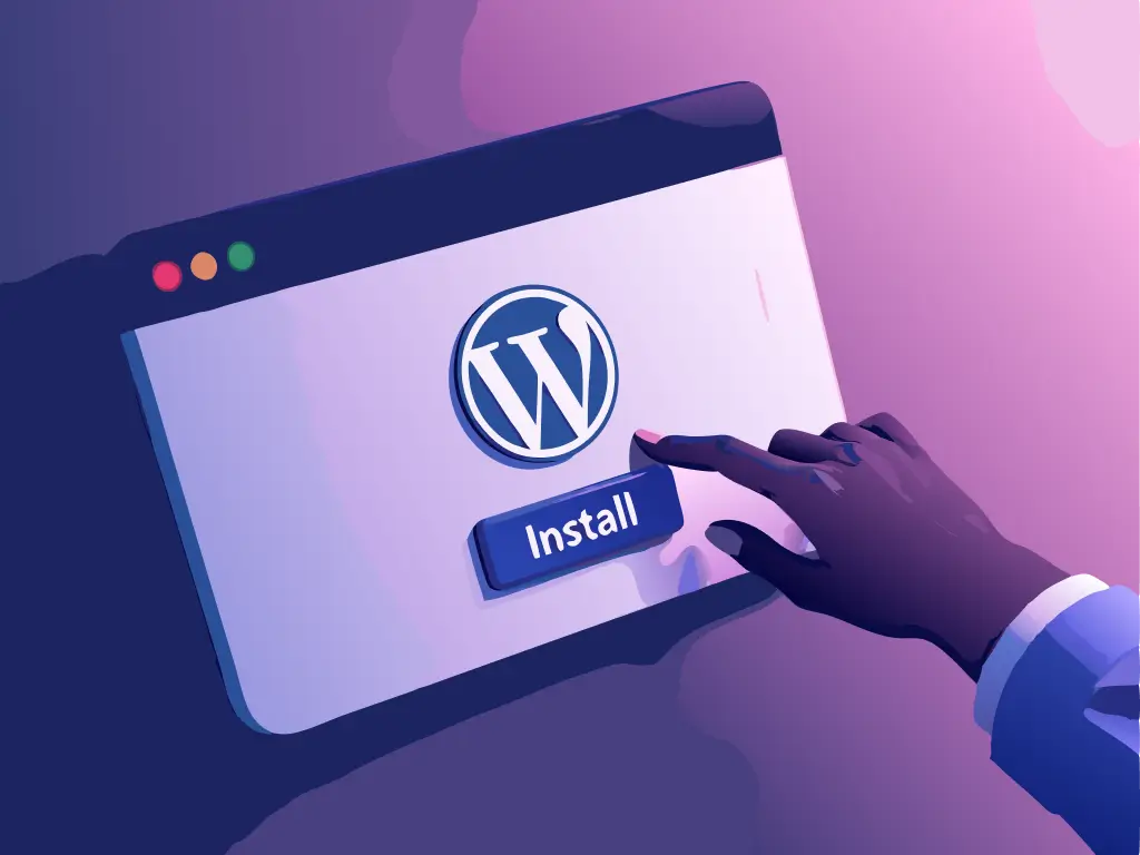
    You have chosen the perfect hosting for your website and are ready to bring your idea to life. What comes next? Setting up WordPress, the top choice for building and maintaining websites.

    Why should WordPress be chosen?

    It offers simplicity, the ability to tailor your project, and a wide range of plugins to enhance site capabilities, spanning from SEO to e-commerce.

    We will assist you in setting up WordPress to help you begin your website successfully.

    Get ready to simplify and begin establishing your online visibility. Ready to get started?

    Is WordPress still significant in 2025?

    WordPress continues to be one of the most significant and effective tools for building and overseeing websites in 2025.

    It currently powers more than 40% of all websites online due to its flexibility and extensive array of features.

    WordPress is versatile and can be used for different kinds of projects such as blogs, portfolios, large e-commerce sites, and corporate websites.

    What makes him still important?

    • The platform provides a wide range of themes and plugins that allow for extensive customizations without starting from the beginning.
    • WordPress’s high market demand means that proficient developers in this platform are consistently sought after for new projects and website upkeep.
    • It is a cost-effective option for new businesses looking to expand to serve larger corporations.

    Mastering WordPress remains a key advantage in 2025, whether you aim to acquire new skills or enhance your online visibility.

    Can WordPress be used at no cost?

    WordPress is available at no cost, but additional expenses may be incurred based on the extent of customization and control desired.

    Yes, you can set up WordPress at no cost.

    There are two primary editions.

    WordPress. org is the platform.

    This is the open-source version that allows you to download the software, tailor it to your preferences, and host the website with your chosen provider. While you have complete control over the site, you will need to cover costs for hosting, domain, and potentially premium themes or plugins.

    WordPress.com

    Provides a complimentary version with WordPress hosting for your website, but it has restrictions like a domain ending in “.wordpress.com” and limited features. Upgrading to paid plans allows access to additional features.

    What are the necessary conditions for setting up WordPress?

    WordPress requires certain fundamental server prerequisites to function correctly.

    1. The UNIX/Linux based server is frequently selected for hosting due to its higher compatibility and stability with WordPress.
    2. PHP version 7 or above is required for optimal performance and security in WordPress as it is the programming language that powers it.
    3. MySQL version 5.6 or newer or MariaDB version 10.0 or newer is required for the database, which holds your website’s data like content, users, and configurations.
    4. PHP Memory of 64 MB is the minimum required for running WordPress, although additional memory may be needed for numerous plugins or complex themes.

    Most contemporary hosts such as Hostbits typically fulfill these criteria, so it is advisable to verify with the provider beforehand.

    Installing WordPress in a gradual manner

    Let’s learn how to set up WordPress on your hosting dashboard without any issues.

    1. Obtain WordPress.

    • Visit wordpress.org’s official website to access and download the most recent version of WordPress.

    2. Get Server Ready

    • Ensure that the server or hosting fulfills the specified requirements.
    • Access the hosting control panel (typically cPanel) and generate a MySQL database along with a user and password.

    3. Transfer the WordPress files

    • Utilize an FTP client like FileZilla to connect to your server.
    • Place the WordPress files in the directory where you intend to set up the website, typically in the “public_html” folder.

    4. First setup

    • Visit your website’s address in the browser to begin the WordPress installation process.
    • Enter the previously created database information (including bank name, username, password, and host).

    Complete the Installation.

    • Establish the website title, generate the user and admin passwords, and set up the contact email.
    • Click on “Install WordPress” shortly after and wait until it’s finished.

    Access the Admin Panel.

    • After installing, access the WordPress dashboard by visiting www.yoursite.com/wp-admin.
    • Utilize the created username and password to log in and begin personalizing the website!

    Right after installation, it is recommended to select a theme and add the necessary plugins for additional functionalities like SEO, security, and performance.

    Ready to launch your website using WordPress?

    Installing WordPress may appear difficult initially, but with the proper guidance, you’ll be able to launch your site swiftly.

    This powerful tool is the top pick for businesses and content creators looking for flexibility, customization, and scalability.

    If you haven’t selected a reliable hosting service for your website, Hostbits is the perfect choice!

    We provide specialized technical support and features that ensure the performance and security of your WordPress project with optimized servers.

    Click here to discover our WordPress optimized hosting plans!

  • Creating a mobile site that is quick and interactive (Step by Step)

    Creating a mobile site that is quick and interactive (Step by Step)

    The internet is readily available on your mobile device. With 60% of Brazilians using smartphones to access the web, having a mobile-friendly website is no longer an advantage, but a necessity.

    Being present on the internet alone is insufficient.

    If your website is slow to load or doesn’t display properly on mobile devices, you risk losing visitors quickly.

    No one tolerates slow or unresponsive pages.

    Creating a quick, responsive, and user-friendly website doesn’t have to be difficult.

    In this article, we will guide you through the process of optimizing your digital presence for mobile devices.

    Shall we begin?

    What is a website designed for mobile devices?

    A mobile site is a tailored version of your primary website, specifically created to function effectively on mobile devices such as smartphones and tablets.

    It adjusts to smaller screens on its own, ensuring that everything is well-organized, easy to read, and quick to navigate.

    Have you ever attempted to view a mobile website and found yourself needing to zoom in to read the text or scroll horizontally because the layout was not responsive?

    This website is not mobile-friendly.

    Entering a fast-loading e-commerce site with large, easy-to-click buttons and smooth navigation is a prime illustration of a mobile site done right.

    A mobile site is more than just a scaled-down desktop version; it is a carefully designed experience for mobile users.

    Responsive websites and mobile websites: Is there a distinction between them?

    Many individuals mistakenly consider mobile sites and responsive sites to be interchangeable, but they are not identical.

    Website

    A distinct edition of the primary website is developed solely for mobile gadgets, featuring a unique design and potentially reduced content for quicker loading. An illustrative instance is websites utilizing a designated subdomain like “m.yourwebsite.com.”

    Website that is able to adjust and adapt to different screen sizes.

    The website is designed to automatically adjust to different screen sizes, such as computers, tablets, or smartphones. The layout changes, buttons are resized, and elements are rearranged to enhance user experience without requiring a different version.

    Today, a responsive website is the most advisable choice because it is simpler to manage, enhances SEO, and provides a consistent user experience on various devices.

    Best strategies for optimizing your mobile website

    By following these guidelines, your mobile website can provide an improved user experience and increase the likelihood of turning visitors into customers.

    Focus on creating a website that is responsive instead of designing a separate version.

    Maintaining two versions of a website can lead to discrepancies and make updates more difficult. A responsive site adjusts to different screens, providing a consistent experience for all users.

    2. Turn off annoying pop-up windows.

    Visitors dislike being greeted by numerous full-screen pop-up windows when accessing a website. These pop-ups not only annoy users but can also negatively impact Google rankings.

    Organize information using user-friendly menus.

    On mobile devices, it is important to use straightforward and user-friendly menus, like the popular “hamburger” menu, to avoid confusion due to smaller screens.

    4. Ensure buttons are big and easy to click.

    It can be frustrating when you accidentally open something else because you tried to click on a small button. Buttons should be a proper size and spaced out well to prevent misclicks.

    Bet on sources that are easy to understand.

    If the reader has to zoom in to see the text clearly, it indicates an issue. Opt for larger fonts and appropriate sizes and contrasts to ensure easy readability.

    Optimize pictures to ensure quick loading.

    Large images can slow down the website, so optimize them by reducing their size without compromising quality and use modern formats such as WebP for faster loading times.

    Avoid having too many items on the page.

    Having too much information and unnecessary elements can lead to longer loading times. Therefore, focus on a clean and straightforward design to improve loading speed.

    Make sure that the forms are simple to complete.

    Reduce unnecessary fields and utilize autofill to prevent visitors from becoming discouraged by excessive typing.

    Always conduct tests on actual devices.

    What is effective on a computer may not work well on a mobile device. So, it’s important to conduct regular tests on various smartphones and screen sizes to guarantee a positive user experience.

    Enhance the speed of loading.

    Many users will abandon a website if it takes longer than 3 seconds to load. Utilize resources such as Google PageSpeed Insights to pinpoint enhancements and streamline scripts and images for faster loading times.

    Creating a mobile website – How to do it?

    WordPress users will be pleased to know that the primary theme templates already include mobile-optimized versions.

    Your website adjusts to smaller screens on its own, providing visitors with a positive experience.

    Elementor and similar tools enable users to personalize all aspects of their website through the control panel, eliminating the need for coding.

    With just a few clicks, you can easily customize fonts, spacing, buttons, and images to ensure they appear perfectly on mobile devices.

    If you wish to build a new mobile site or enhance an existing one, you can follow these straightforward steps.

    Select a theme that is responsive.

    Themes like Astra, GeneratePress, and OceanWP in WordPress are already optimized for mobile devices.

    2. Set up Elementor (or another page builder)

    With Elementor, you have the ability to visually modify your website and customize the design for various devices.

    3. Modify elements on mobile devices

    Enable mobile viewing and customize fonts, buttons, spacing, and images in the Elementor panel.

    Test the speed and make improvements.

    Utilize tools such as Google PageSpeed Insights to guarantee fast loading times for the website on mobile devices.

    Test on actual devices should be conducted.

    Always test on actual smartphones to guarantee smooth navigation, even after using the Elementor preview.

    Build your mobile website easily with Hostbits Website Builder.

    Create a professional website without any technical expertise.

    The Hostbit Website Builder is perfect for those looking for convenience, contemporary design, and compatibility across all devices.

    You can easily customize your site with simple drag and drop tools, without the need for complex codes or details.

    What are the reasons for selecting the Hostbit Website Builder?

    • Choose from top themes and effortlessly customize to match your preference.
    • Your website adapts seamlessly to any screen size, ensuring it looks great on mobile, tablet, or desktop devices.
    • Access a variety of professional photos in the free image library to enhance the appearance.
    • Simplified integration with WordPress allows for easy installation to access all the features of the world’s most popular platform.
    • Count on Hostbits for comprehensive technical assistance whenever you require it.

    With the Hostbit Website Builder, you can easily craft an attractive, practical, and standout website.

    Begin immediately and bring your online project to life!