Tag: (step

  • Cloud Migration: an uncomplicated process outlined step by step

    Cloud Migration: an uncomplicated process outlined step by step

    Migration to the cloud is a crucial move for small and medium-sized businesses that must adjust to new ways of working.

    However, concerns regarding security, adaptability, and selecting the most suitable provider continue to delay the transition to cloud computing.

    Many companies find that a successful transition to the cloud can lower expenses, enhance flexibility, and greatly lessen the chance of a cyber attack threatening the viability of their business.

    What is the difficulty level and advantages of moving to the cloud?

    What is cloud migration?

    Cloud computing is the provision of computing services as needed.

    It typically includes applications, storage, and processing power delivered over the Internet and charged based on usage.

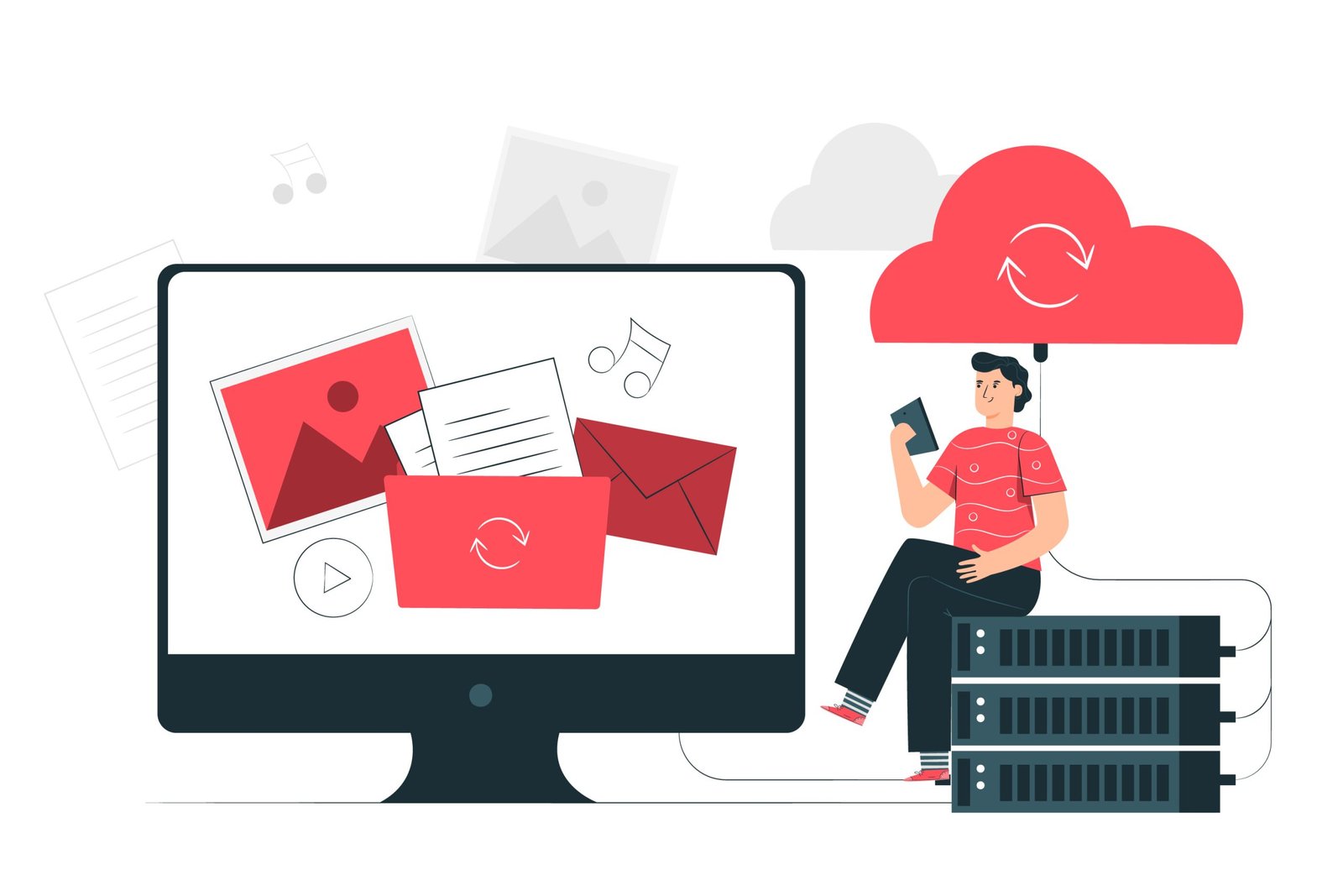
    A cloud migration happens when a company transfers some or all of its datacenter or local server resources to the cloud.

    To operate on cloud-based infrastructure offered by cloud service providers like AWS, Google Cloud, or Azure.

    Why is it important for businesses to migrate to the cloud?

    Cloud computing has seen significant growth in recent years, not limited to just large corporations.

    49% of major companies are already utilizing a form of cloud model in their IT infrastructure, as stated in the research “Brazilian Software Market – Panorama and Trends 2020” by ABES.

    37% of small businesses have fully embraced the cloud, with a growing trend, according to a study by Emergent Research and Intuit.

    Cloud computing continues to grow rapidly in Brazil.

    Cloud solutions often offer a more favorable cost-benefit ratio compared to local applications.

    The difficulties of remote and hybrid work have led to an increased transition to cloud services at all levels.

    Data accessibility, collaboration, and ease of access were key factors that led to adherence.

    Advantages of moving to the cloud.

    The move to cloud computing is a key aspect of adapting to new market requirements and fostering innovation, yet there are lingering uncertainties about its actual advantages.

    Therefore, we present the key benefits of transitioning to the specified cloud. Take a look:

    Safety

    Storing business information and data centrally in the cloud offers enhanced security compared to conventional data centers.

    Most providers also include various built-in security functions like security assessments, regular updates, and interoperability with other businesses.

    Scalability and adaptability

    An IT solution that was perfect for a year may become outdated after a few years, posing challenges for businesses to adjust to evolving customer needs.

    Organizations can adjust their infrastructure to meet present requirements without relying on outdated equipment.

    Increased speed and enhanced efficiency

    Cloud migration enables your business to seamlessly integrate systems and enhance operational efficiency across all your services.

    Remote entry

    All your information is stored in the cloud, making it accessible regardless of the status of your physical devices.

    Moving to the cloud enables employees to access necessary data and business information from any location worldwide using any device.

    Benefit cost

    Public cloud servers like AWS, Microsoft, IBM, Google, and Oracle can lower your expenses for maintenance, energy, and personnel per server unit when compared to a privately operated data center.

    Is migrating to the cloud equivalent to migrating to Google Workspace?

    When we refer to a “transition to Google Workspace,” we are essentially discussing the shift from any email platform and office software to Google Cloud services (Google Workspace).

    Therefore, the switch to Google can be accomplished through three main pillars.

    Creating the right setting for every user

    Google Workspace is a system of tools where everything is interconnected within a single platform.

    Each user in your organization has unique needs, work methods, and duties.

    It is important to make sure that the environment is appropriate for each individual or user type during a migration process to fully utilize the advantages of the new package being obtained.

    Migrating Your Information

    This relates to transferring email messages, files, calendars, contacts, etc., to Google Workspace from a different service provider.

    When considering moving to a new system, people often focus on this aspect, but it is just one part of the overall process.

    Maximize the advantages of this new working method by ensuring that users fully embrace it.

    Users should feel encouraged to try out new tools, and involving everyone from the start can help minimize any delays during the transition phase.

    What is the optimal Google Workspace plan for your business?

    Cloud migration plan

    Most companies adopt a long-term approach when migrating to the cloud, rather than doing it quickly.

    There are numerous tasks that can be accomplished using cloud technology, such as enhancing backup procedures and overseeing communication systems.

    Before creating a plan, identify the most important aspects for your business.

    Compare options and seek advice from an expert in the field to narrow down your choices to two or three suppliers for testing.

    Define the causes and importance.

    First, it is important to comprehend the reasons behind the need for change. This entails examining the areas of your business that could benefit financially from transitioning to cloud services.

    Identify expenses

    After establishing your priorities, it is advisable to assess the expenses involved in transitioning your business to the cloud. Once you have a clear plan and understand the potential advantages, the next step is to calculate the associated costs.

    Select the vendor

    Choosing the appropriate cloud provider depends on finding a balance between your requirements and financial constraints.

    Seek out an individual with expertise in a related field and a grasp of your company’s unique aspects.

    Plan the transfer.

    Your top priority when transitioning major business processes to the cloud should be reducing the downtime for your team.

    Examine your schedule carefully to determine the ideal time for your transition.

    Shortly after, establish the sequence of migration and define specific deadlines and metrics to ensure successful implementation.

    Most businesses opt to transfer their data, applications, and information from a private server or on-premises data center to a public cloud infrastructure.

    Each migration to the cloud is distinct, just like every business.

    The level of difficulty in moving to the cloud varies based on the quantity of resources supported in individual projects.

    What can be transferred?

    Many online applications have the potential to be transferred to cloud computing.

    Therefore, through migration, your company and employees can benefit from all the advantages offered by cloud computing, as discussed in the previous section.

    The following are the primary uses that can be moved to the cloud:

    • Business service platforms.
    • Web and mobile applications.
    • IoT systems.
    • Edge servers are servers located at the edge of a network.
    • CRM support systems are in place.
    • Productivity Software.
    • Corporate databases.
    • Remote Desktops.
    • Network management tools and additional resources.

    Consult with professionals during your transition to the cloud!

    The process of moving to the cloud is a significant milestone for any business.

    Consequently, it must be carefully organized and arranged to avoid affecting your efficiency.

    We observed various levels and migration strategies, ranging from transferring files to cloud hosting to developing applications and cloud systems for enabling remote employee access.

    It’s crucial to have specialists during the cloud migration process, and Hostbits can be your ally.

  • Creating a mobile site that is quick and interactive (Step by Step)

    Creating a mobile site that is quick and interactive (Step by Step)

    The internet is readily available on your mobile device. With 60% of Brazilians using smartphones to access the web, having a mobile-friendly website is no longer an advantage, but a necessity.

    Being present on the internet alone is insufficient.

    If your website is slow to load or doesn’t display properly on mobile devices, you risk losing visitors quickly.

    No one tolerates slow or unresponsive pages.

    Creating a quick, responsive, and user-friendly website doesn’t have to be difficult.

    In this article, we will guide you through the process of optimizing your digital presence for mobile devices.

    Shall we begin?

    What is a website designed for mobile devices?

    A mobile site is a tailored version of your primary website, specifically created to function effectively on mobile devices such as smartphones and tablets.

    It adjusts to smaller screens on its own, ensuring that everything is well-organized, easy to read, and quick to navigate.

    Have you ever attempted to view a mobile website and found yourself needing to zoom in to read the text or scroll horizontally because the layout was not responsive?

    This website is not mobile-friendly.

    Entering a fast-loading e-commerce site with large, easy-to-click buttons and smooth navigation is a prime illustration of a mobile site done right.

    A mobile site is more than just a scaled-down desktop version; it is a carefully designed experience for mobile users.

    Responsive websites and mobile websites: Is there a distinction between them?

    Many individuals mistakenly consider mobile sites and responsive sites to be interchangeable, but they are not identical.

    Website

    A distinct edition of the primary website is developed solely for mobile gadgets, featuring a unique design and potentially reduced content for quicker loading. An illustrative instance is websites utilizing a designated subdomain like “m.yourwebsite.com.”

    Website that is able to adjust and adapt to different screen sizes.

    The website is designed to automatically adjust to different screen sizes, such as computers, tablets, or smartphones. The layout changes, buttons are resized, and elements are rearranged to enhance user experience without requiring a different version.

    Today, a responsive website is the most advisable choice because it is simpler to manage, enhances SEO, and provides a consistent user experience on various devices.

    Best strategies for optimizing your mobile website

    By following these guidelines, your mobile website can provide an improved user experience and increase the likelihood of turning visitors into customers.

    Focus on creating a website that is responsive instead of designing a separate version.

    Maintaining two versions of a website can lead to discrepancies and make updates more difficult. A responsive site adjusts to different screens, providing a consistent experience for all users.

    2. Turn off annoying pop-up windows.

    Visitors dislike being greeted by numerous full-screen pop-up windows when accessing a website. These pop-ups not only annoy users but can also negatively impact Google rankings.

    Organize information using user-friendly menus.

    On mobile devices, it is important to use straightforward and user-friendly menus, like the popular “hamburger” menu, to avoid confusion due to smaller screens.

    4. Ensure buttons are big and easy to click.

    It can be frustrating when you accidentally open something else because you tried to click on a small button. Buttons should be a proper size and spaced out well to prevent misclicks.

    Bet on sources that are easy to understand.

    If the reader has to zoom in to see the text clearly, it indicates an issue. Opt for larger fonts and appropriate sizes and contrasts to ensure easy readability.

    Optimize pictures to ensure quick loading.

    Large images can slow down the website, so optimize them by reducing their size without compromising quality and use modern formats such as WebP for faster loading times.

    Avoid having too many items on the page.

    Having too much information and unnecessary elements can lead to longer loading times. Therefore, focus on a clean and straightforward design to improve loading speed.

    Make sure that the forms are simple to complete.

    Reduce unnecessary fields and utilize autofill to prevent visitors from becoming discouraged by excessive typing.

    Always conduct tests on actual devices.

    What is effective on a computer may not work well on a mobile device. So, it’s important to conduct regular tests on various smartphones and screen sizes to guarantee a positive user experience.

    Enhance the speed of loading.

    Many users will abandon a website if it takes longer than 3 seconds to load. Utilize resources such as Google PageSpeed Insights to pinpoint enhancements and streamline scripts and images for faster loading times.

    Creating a mobile website – How to do it?

    WordPress users will be pleased to know that the primary theme templates already include mobile-optimized versions.

    Your website adjusts to smaller screens on its own, providing visitors with a positive experience.

    Elementor and similar tools enable users to personalize all aspects of their website through the control panel, eliminating the need for coding.

    With just a few clicks, you can easily customize fonts, spacing, buttons, and images to ensure they appear perfectly on mobile devices.

    If you wish to build a new mobile site or enhance an existing one, you can follow these straightforward steps.

    Select a theme that is responsive.

    Themes like Astra, GeneratePress, and OceanWP in WordPress are already optimized for mobile devices.

    2. Set up Elementor (or another page builder)

    With Elementor, you have the ability to visually modify your website and customize the design for various devices.

    3. Modify elements on mobile devices

    Enable mobile viewing and customize fonts, buttons, spacing, and images in the Elementor panel.

    Test the speed and make improvements.

    Utilize tools such as Google PageSpeed Insights to guarantee fast loading times for the website on mobile devices.

    Test on actual devices should be conducted.

    Always test on actual smartphones to guarantee smooth navigation, even after using the Elementor preview.

    Build your mobile website easily with Hostbits Website Builder.

    Create a professional website without any technical expertise.

    The Hostbit Website Builder is perfect for those looking for convenience, contemporary design, and compatibility across all devices.

    You can easily customize your site with simple drag and drop tools, without the need for complex codes or details.

    What are the reasons for selecting the Hostbit Website Builder?

    • Choose from top themes and effortlessly customize to match your preference.
    • Your website adapts seamlessly to any screen size, ensuring it looks great on mobile, tablet, or desktop devices.
    • Access a variety of professional photos in the free image library to enhance the appearance.
    • Simplified integration with WordPress allows for easy installation to access all the features of the world’s most popular platform.
    • Count on Hostbits for comprehensive technical assistance whenever you require it.

    With the Hostbit Website Builder, you can easily craft an attractive, practical, and standout website.

    Begin immediately and bring your online project to life!